LORD & TAYLOR
>> Project
LORD & TAYLOR
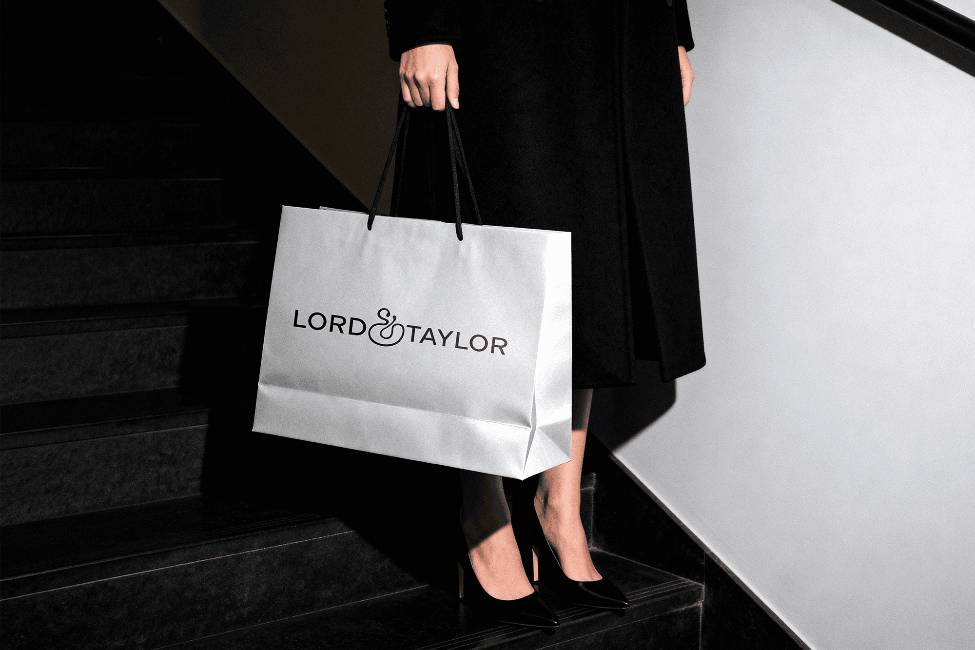
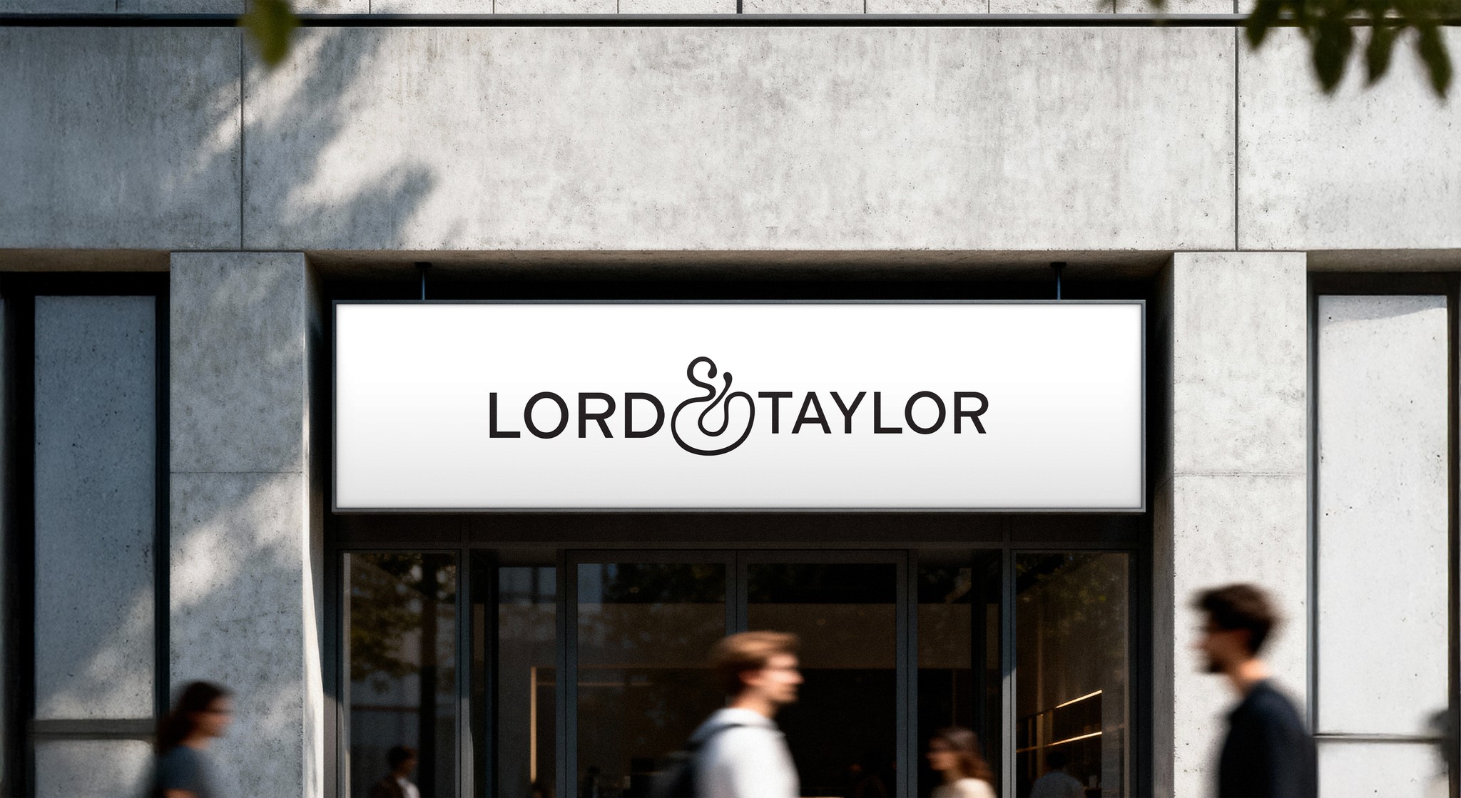
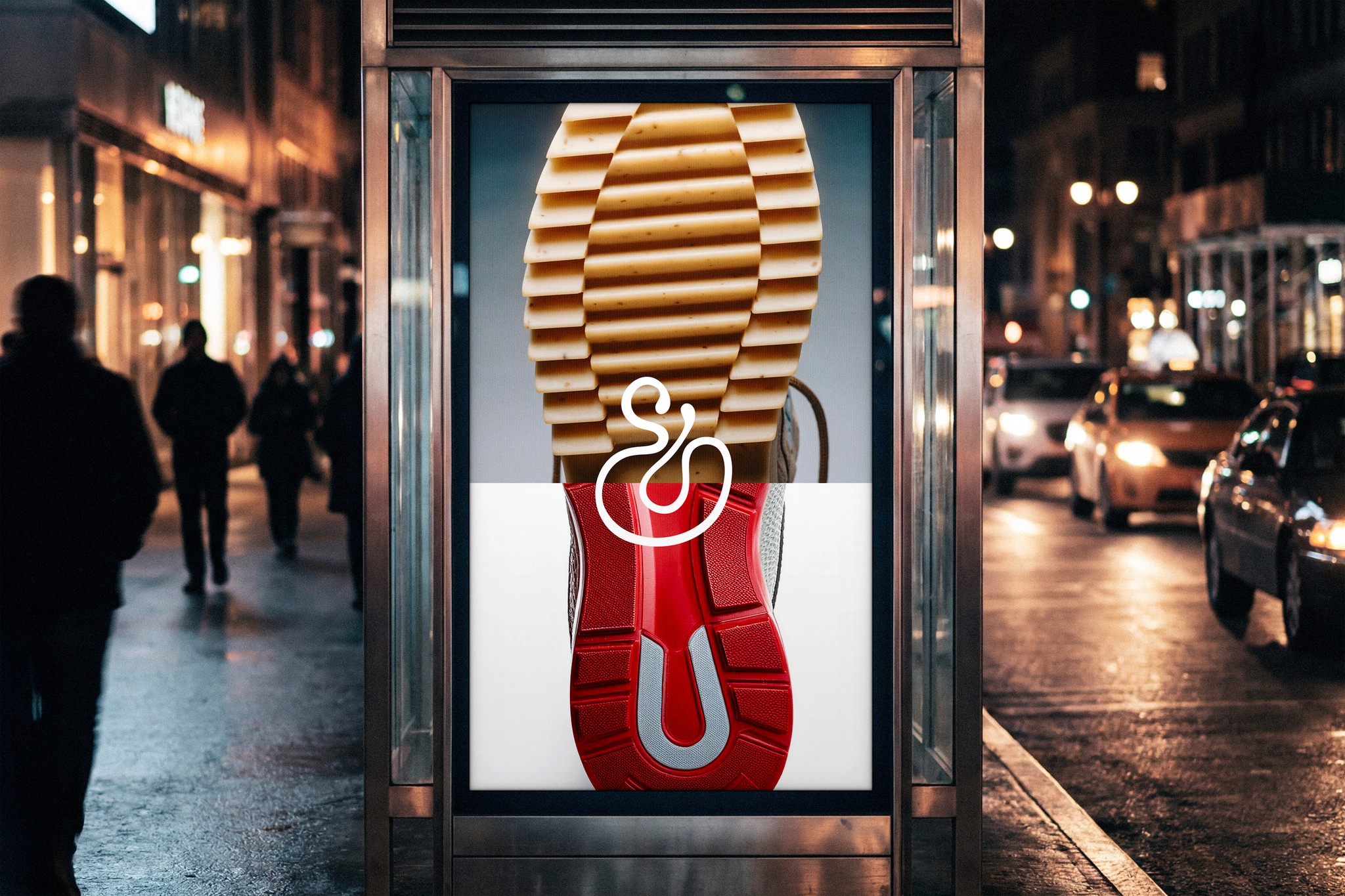
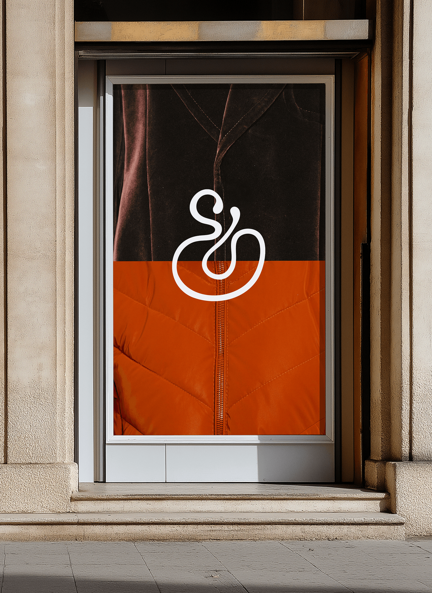
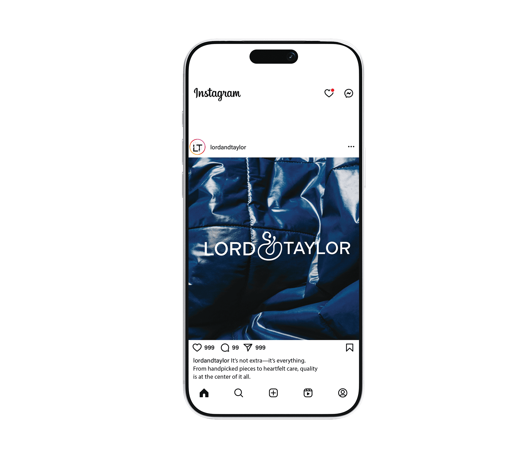
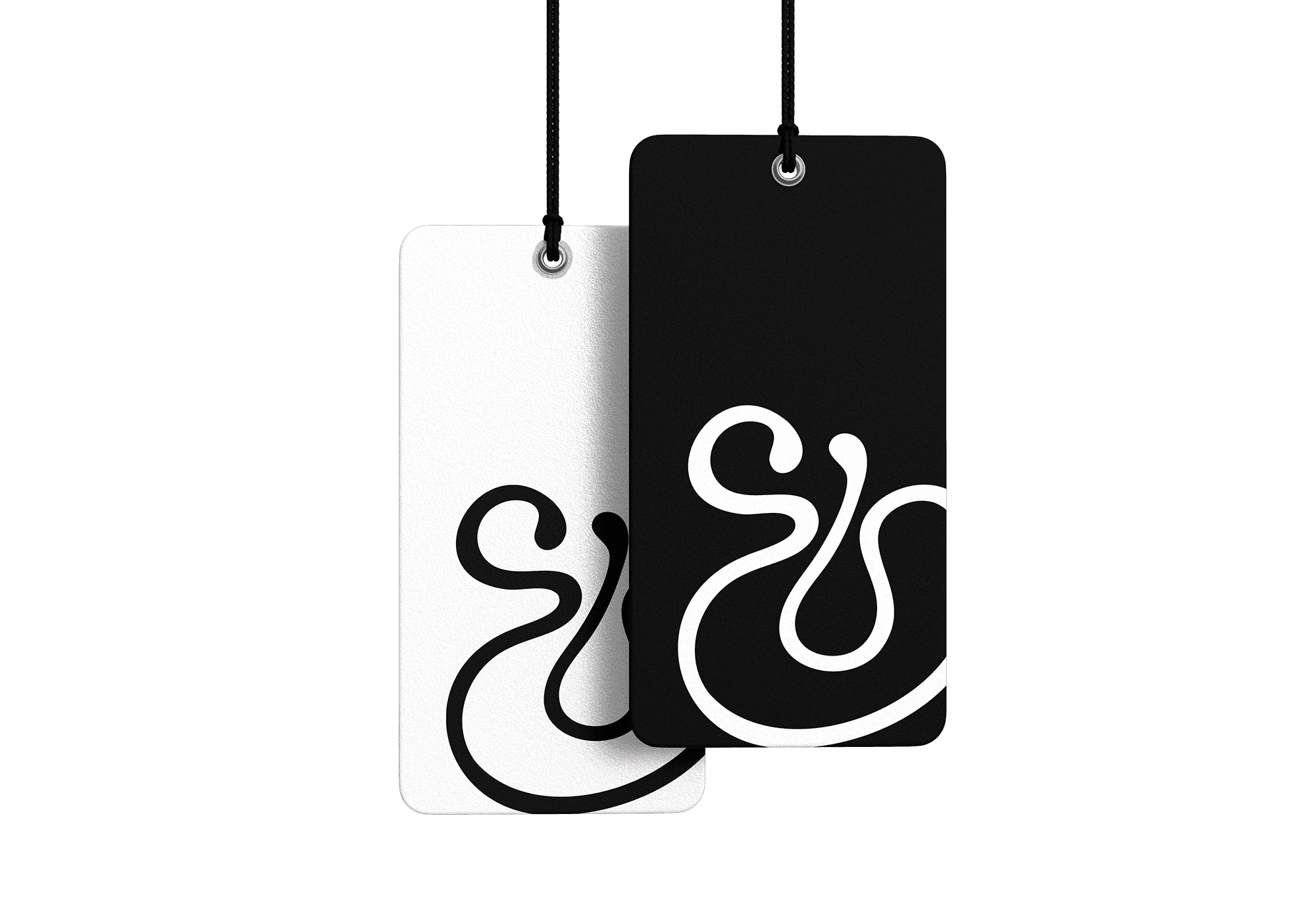
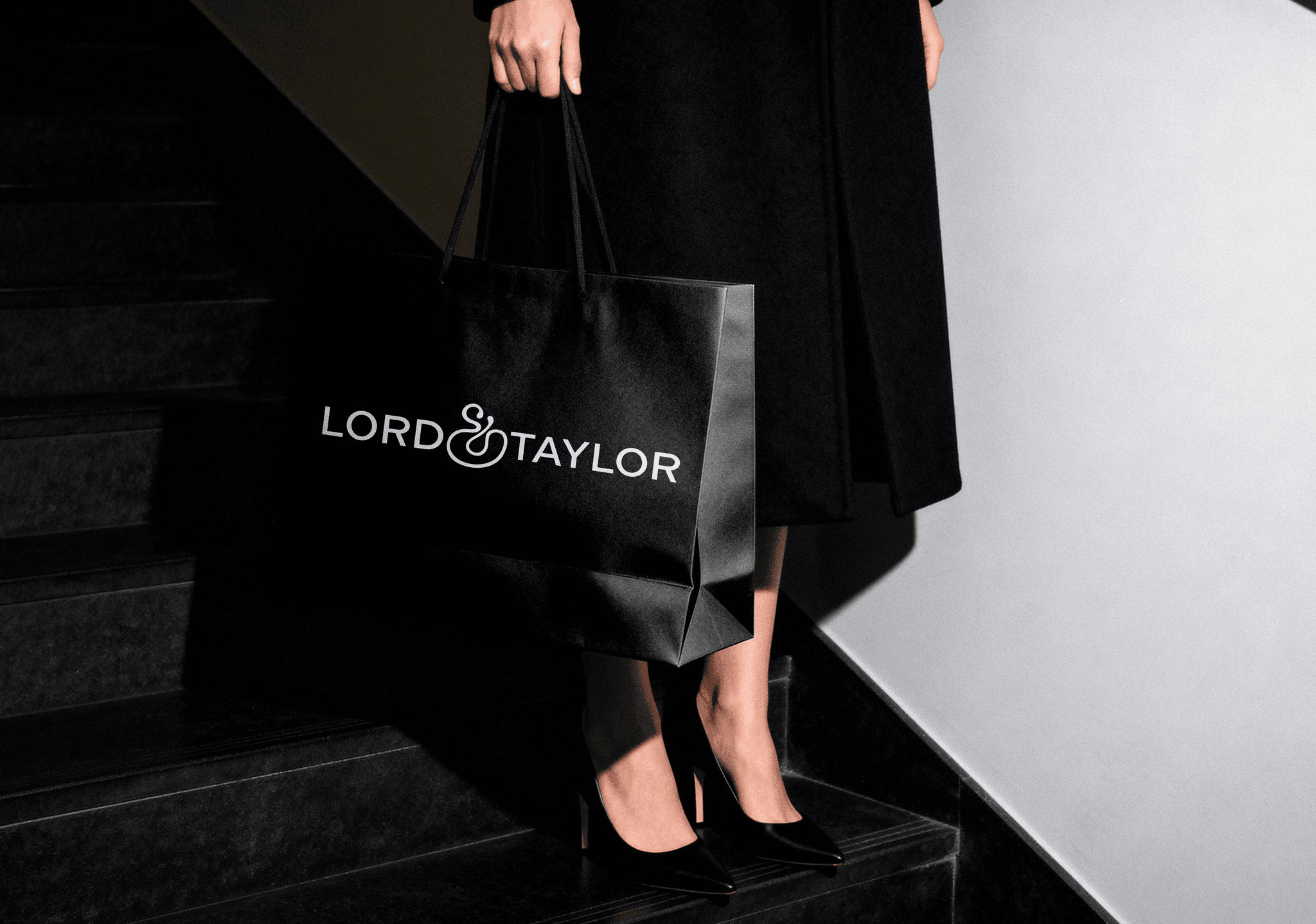
Problem: Lord & Taylor’s new logo has been inconsistently rolled out, with the old version still visible and no clear explanation provided. Replacing an ampersand with a plus sign shifts the brand toward mass-market territory, resembling retailers like Sears or JCPenney. The mark feels unbalanced, with unnecessary spacing and a mark where the plus sign dominates. Solution: Rooted in the concept of “Limitless & Tailored,” the redesign reclaims Lord & Taylor as a brand of refined self-expression. Lord & Taylor Light introduces the tone of calm confidence, anchoring the palette with versatility across modern and classic applications. New Order typeface bridges heritage and contemporary sensibility, while simple abstract forms reinforce tailored individuality, creating an identity that feels intentional and enduring.