AT THE CROSSROADS
>> Project
AT THE CROSSROADS
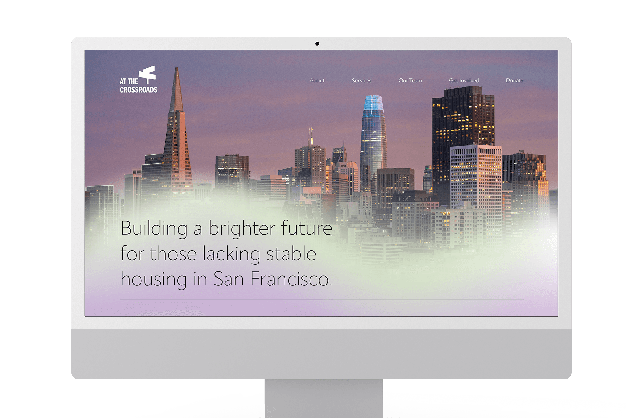
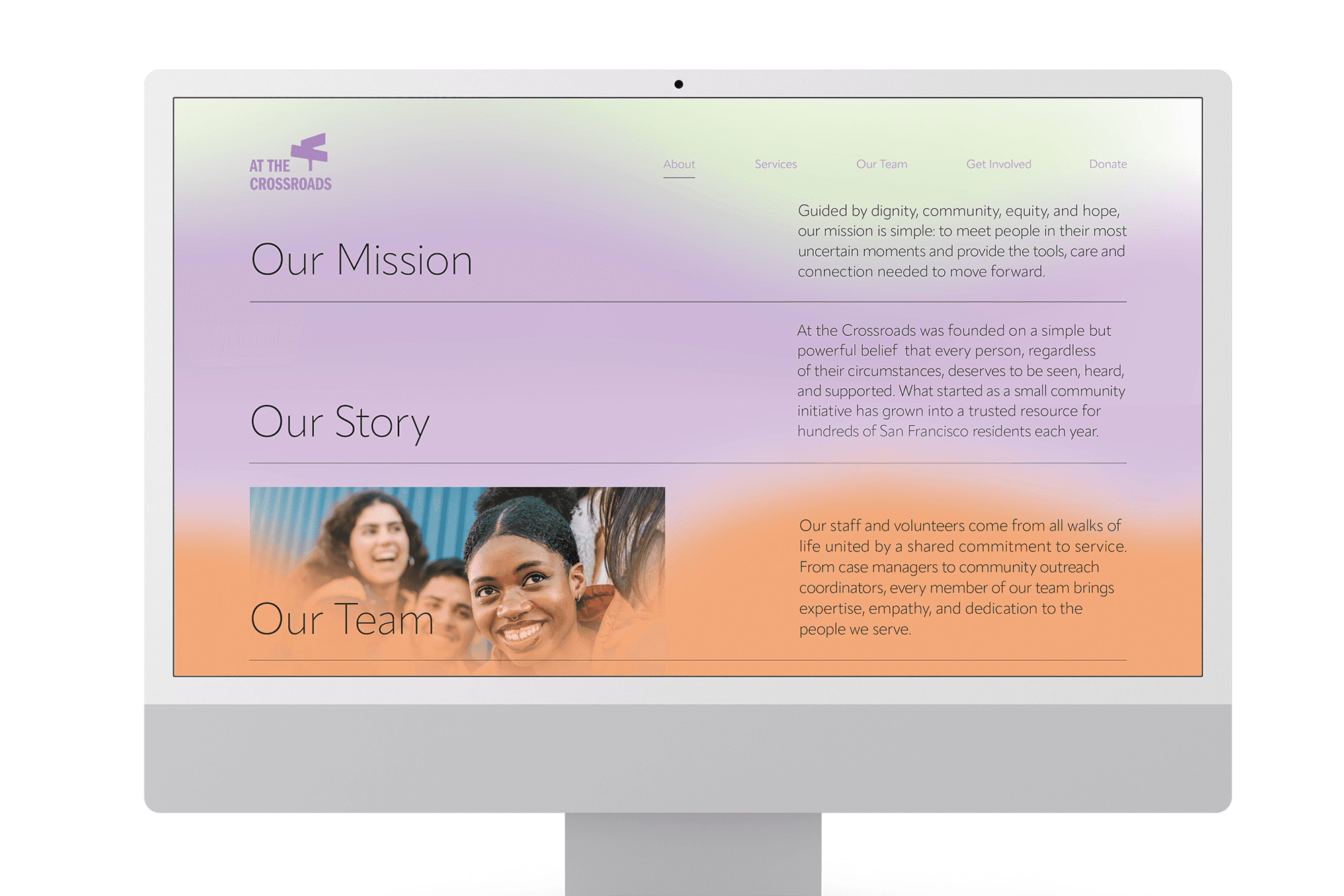
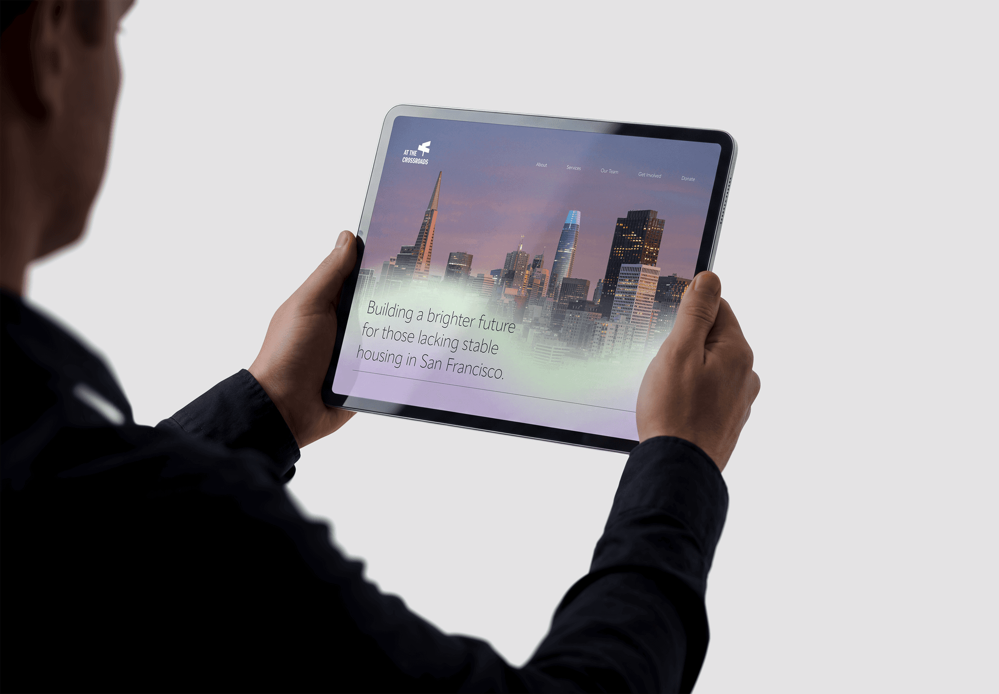
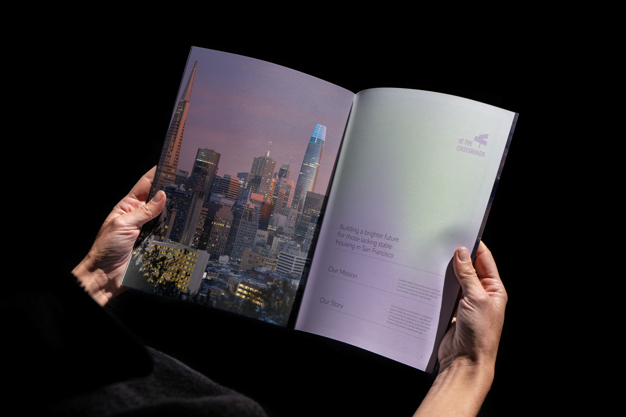
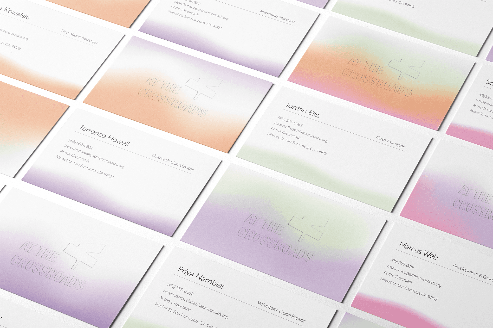
Problem: The objective was to redesign the visual system for At the Crossroads while honoring over two decades of trust built with San Francisco’s most under served homeless youth, without altering the logo they have established. The system must speak to young adults who actively avoid traditional services, reaching an audience that has often experienced rejection from the institutions meant to help them. Solution: Guided by the keyword transformation, the redesigned system uses thin, elegant typefaces to convey fluidity, honesty, and growth across every touch point. A gradient expanding from ATC’s original brand purple reflects the journey of change the organization makes possible, while imagery celebrates the beauty and opportunity of the city these young people belong to, reinforcing connection and trust.